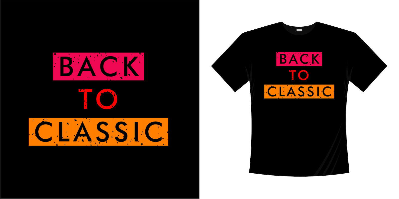
Picture this: you just spent a considerable amount of time working on a new t-shirt design. You then set foot in the printing company, all bright-eyed and bushy-tailed – anticipating the moment where you get to see your masterpiece come to life! But lo and behold, because of that one bad design decision – the font choice – your t-shirt looks entirely different from what you picture in your head. It ended up looking amateurish and cheap – definitely not something you want your artwork to reflect.
With so many things to consider, it seems like choosing the right font can be left as an afterthought, right? Nah, we beg to differ! The font matters. In fact, it matters a lot. Look, when it comes to custom printed t-shirts, font styles can seriously pack a punch. It has the power to make or break the readability and the message you want to send across dramatically. So be sure to give it a great deal of thought.
But what do you do when you’re not a seasoned designer and having to spend hours sifting through the sea of fonts in the library just seems so tedious and daunting? Lucky for you, our team at Printee Singapore is here to help! In this article, we will be running through the fundamentals of typography and a few considerations that will help guide you along the right track.
Play around with the different fonts
If you’re entirely new to the design sphere, there are four basic font types that you absolutely need to know: Serif, Sans Serif, Script and Display. What do they entail?
Serif
Perhaps the oldest typeface style inspired by calligraphy, serif fonts have got a small extra stroke or taper (also commonly referred to as “tails” or “feet) added to the main vertical and horizontal strokes of some letters to aid in their readability. They are often regarded as classic and traditional, and can come off to be authoritative. “Times New Roman” is an example.
Sans Serif
Arial, Verdana and Helvetica are two popular san serif fonts. Unlike the serif fonts, sans serif fonts do not have the “feet” element, offering a more clean and contemporary look. Brands that want to come off as approachable tend to leverage this font type. Think – Google and Apple.
Script
Script fonts are cursive and can give off the impression of handwritten texts. They are great if you want to add a bubbly or elegant personality to your design, but can also be tricky to work with as they’re often harder to read.
Display
Funky, elaborated and attention-grabbing, display fonts are the epitome of creativity and work impressively as a design focal point. However, be sure to use them sparingly and strategically, as they’re often the culprits that make the word hard to read.
If you want to create a visual hierarchy, you can consider playing with different combinations and layouts – like pairing serif and non-serif fonts together. Taking the time to go through the options will ensure that your fonts work nicely in tandem and at the same time relay the intended message and emotion without looking just like a wall of texts.
Less is more
The saying “less is more” is incredibly apt when it comes to choosing fonts. Riddling your personalised printed t-shirt with multiple typefaces can add chaos and clutter to your overall design – which is a no-no. As a general rule of thumb, stick to two or three fonts.
Take note of the kerning
Kerning refers to the spacing between letters. More than just spacing, kerning ensures that the text looks balanced and not awkward, which is why great designers often emphasise so much about it. Giving the letters more “room” around them also ensures that the texts are legible. Experiment with it and see what works for your eyes!
Final remarks
At the end of the day, font style can be very subjective. There is no one-size-fits-all guideline, and it’s all about experimenting. If you do have any technical questions or difficulties, please do not hesitate to speak to us!


